
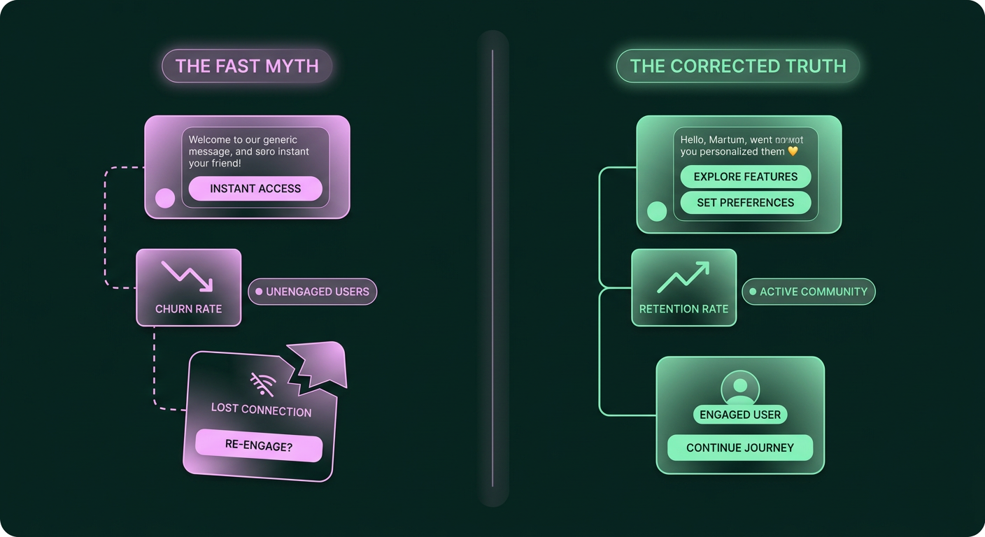
The conventional wisdom for mobile apps is that the best onboarding is the shortest one. The goal, you've been told, is to rush users from install to the main interface in as few screens and seconds as possible. But this advice is often a trap. While a streamlined flow is important, focusing only on speed means you might be sacrificing the very thing that makes users stick around: a genuine understanding of your app's value. Rushing them through the front door only to leave them confused in an empty room is a recipe for churn.
You’ve been told shorter onboarding is always better. It’s not.
The prevailing belief is that the ideal mobile app onboarding should be as brief as possible, often just 3-5 screens completed in under 90 seconds (opens in a new tab). And while that's a decent rule of thumb, treating it as an unbreakable law is a critical mistake. It overlooks the true purpose of onboarding, which isn't just about getting users into the app, but getting them invested in the app.
A myopic focus on speed leads to a shallow first impression. You might succeed in reducing the time to completion, but you fail to build context, demonstrate core features, or guide the user to their first "aha" moment. This creates a leaky bucket where users who were interested enough to install your app simply drift away because they never found a reason to stay. The goal isn't to be the fastest; it's to be the most effective at turning a curious installer into an activated user.
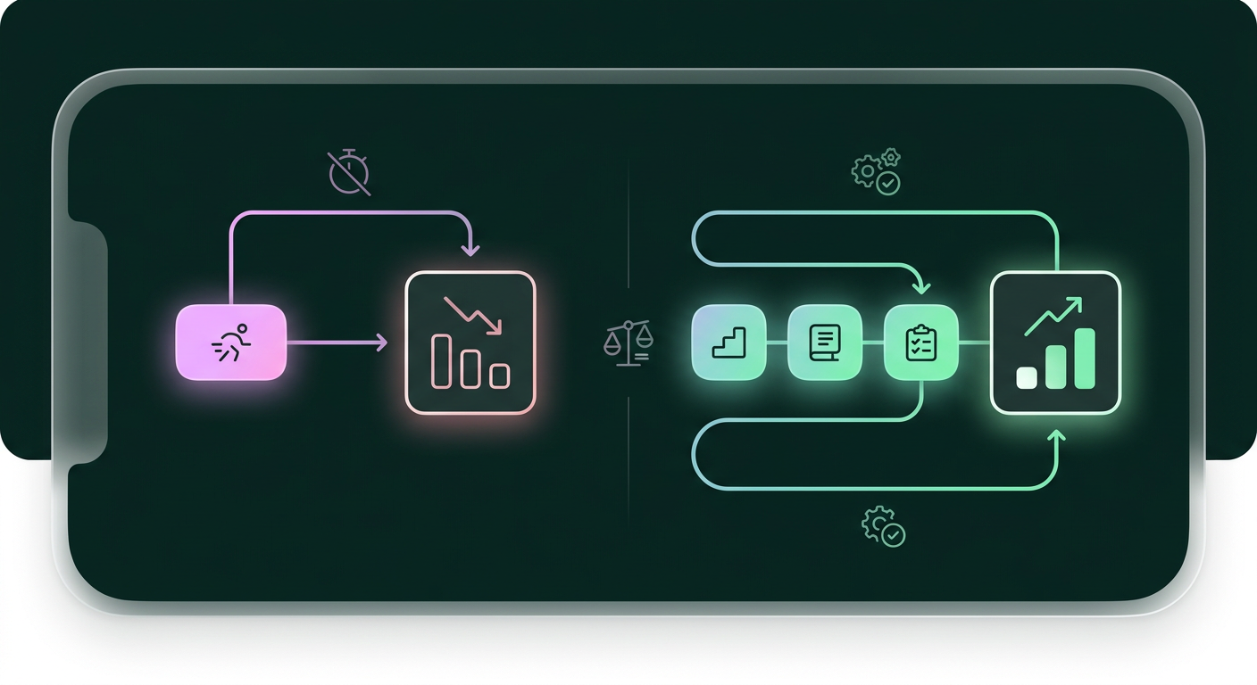
Why the 'shorter is better' myth feels so right
If it's not always the best path, why does this idea persist? The obsession with speed isn’t irrational; it’s a direct response to some very real and painful user behaviors that every app growth leader has witnessed.
The data seems to scream that users have no patience, which is why so many smart people believe shorter onboarding is better. With high drop-off rates in the first few minutes and days after an install, it feels logical to remove every possible barrier. The fear is that any friction, no matter how small, will cause a potential user to abandon the app for good.
The numbers are genuinely alarming. Industry reports consistently show that over 20% of users will abandon an app after the first use, and fewer than 10% are still active after a month. The initial 24 hours are particularly brutal, with some data suggesting that as many as 80% of installs can drop off during this period (opens in a new tab). When you’re faced with such a steep decline, the natural reaction is to trim the fat. Every screen, every field, and every tap feels like another opportunity for a user to leave.
This fear is amplified by common onboarding mistakes that act as major leak points. Forcing a mandatory account creation before a user has experienced any value is a classic example of friction that drives users away (opens in a new tab). When you see users churning, it's tempting to conclude that the entire process is too long. In fact, a poor onboarding experience is a leading cause of churn. According to a 2024 report, it was the 3rd most common reason customers leave an app (opens in a new tab), right behind the product not being a good fit and low engagement. So the instinct to shorten the flow comes from a very real place.
The surprising data on longer, smarter onboarding
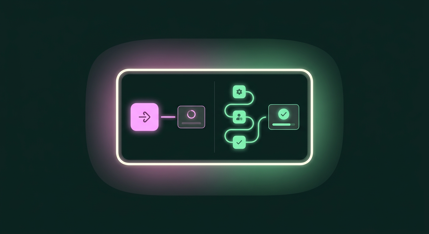
That understandable instinct, however, often points in the wrong direction. While a needlessly long and confusing flow is always bad, a strategically longer, more engaging onboarding can produce significantly better results than a rushed one.
Counterintuitively, a longer onboarding that successfully engages the user can lead to higher activation, retention, and conversion. Instead of creating friction, these more involved flows build psychological investment and give you the time needed to properly demonstrate your app's value, which is far more important than speed.
The key is what happens during that extra time. A longer flow of pointless screens will only increase drop-off. But a longer flow that guides the user, helps them set up their profile, or demonstrates a key feature creates a sense of investment. This taps into a powerful psychological principle. As one expert noted on a LinkedIn discussion:
"Another psychological principle that longer onboarding flows tap into is the sunk cost effect - as I go deeper into the onboarding flow, the more invested I become in seeing it through. Fits nicely with your point about increased activation, engagement + retention and subscriber conversion rates." , Phil Carter, LinkedIn
This isn't about making the onboarding long for its own sake. The truth is, the optimal approach depends on several factors, including your product's complexity and your audience's familiarity with its category. A simple game might need very little onboarding, while a powerful productivity tool requires more guidance to prevent overwhelming a new user. The goal is to provide just enough context for the user to do something meaningful.
From speed to substance: a new goal for onboarding
If speed isn't the main goal, your focus needs to shift from minimizing time to maximizing early engagement and guiding the user to their first "aha" moment.
The true goal of mobile app onboarding isn't speed, but substance. It’s about methodically guiding a new user from install to the moment they personally experience your app's core value. This 'journey to value' is what creates activated users who stick around, and its length is secondary to its effectiveness.
For powerful tools with a learning curve, for instance, a demo-like first session is far more effective than dropping a user into a blank slate. Consider Notion's approach: instead of presenting an empty canvas, it starts users with a pre-populated template workspace. This immediately solves the "blank page problem" and lets users learn by interacting with something that already works. They see the value by doing, not by reading tooltips. This takes more time than a simple three-screen tour, but it's infinitely more effective at building a foundation for long-term use.
This principle applies across categories. Whether it's helping a user find their first show on a streaming app, make their first trade on a finance app, or win their first level in a game, the job of onboarding is to orchestrate that first taste of success. To do this, you need to understand the user's journey from the moment of acquisition and use that context to personalize their first experience. This is a core part of building a modern, direct to consumer marketing strategy that focuses on the full lifecycle.
How to rethink your onboarding flow today
With this new goal in mind, your approach to analysis has to change. Instead of just optimizing, you need to think like a diagnostician, understanding not just that users are dropping off, but why.
To move from a fast onboarding to an effective one, you need to analyze your current flow with a focus on user context and moments of friction. This means connecting acquisition sources to the first session, identifying specific points of confusion, and earning user permissions instead of demanding them upfront.
Connect acquisition source to the first session
A user who came from an ad for "budgeting templates" has a different intent than one who came from an ad for "investment tracking," and your onboarding should reflect that. By carrying the context of where a user came from into their first session, you can tailor the experience to their specific motivation. This creates a more cohesive journey and immediately shows the user that your app can solve their problem. Your app's ability to turn event data into personalized journeys (opens in a new tab) is critical for bridging this gap between acquisition and activation.
Identify where users get lost (and why)
Finding the exact moments where users get stuck or confused is no longer a guessing game. While manually watching session replays is time-consuming, modern tools have changed the game. For example, some AI-powered analytics tools can now analyze first-session replays at scale to automatically identify the user behaviors most strongly correlated with churn. This lets you pinpoint specific UI elements, confusing copy, or broken flows that are causing users to leave, and then use data-guided experimentation to fix them.
Don't ask for permissions without context
One of the most common onboarding mistakes is asking for permissions, like push notifications, on the very first screen. At this point, the user has zero context for why they should say yes. The result? iOS opt-in rates can collapse below 30% when the prompt appears too early. Instead, wait until the user is about to perform an action where a notification would be genuinely useful. For example, ask for notification permission when they follow a friend, so you can alert them when that friend is active. You earn the permission by demonstrating its value first. This same logic applies to re-engaging users who have gone quiet. A well-timed, personalized DM is far more effective than a generic push notification, especially if you're trying to re-engage inactive users in a community app.
Your next step: Map one user's journey to value
So how do you put this into practice? Instead of trying to overhaul your entire onboarding at once, start by manually tracing the path of a single new user from install to their first moment of success. This exercise makes the "journey to value" tangible and reveals real-world friction and opportunities you can't see in aggregate data alone.
Pick a real user who just signed up. Follow their footsteps. What ad did they click? What did they do in their first session? Where did they hesitate? Did they reach an "aha" moment? If so, what was it? If they left, where did they drop off? Document every step. This qualitative insight is invaluable.
Once you’ve done this manually, you can use tools to do it at scale. Funnel analysis platforms, like those offered by VWO, can help you establish baseline conversion rates and pinpoint the biggest drop-off stages across your entire user base. But the initial, manual journey-mapping gives you the empathy to interpret that quantitative data correctly. It changes your perspective from "How do we make this shorter?" to "How do we make this moment better?"
The businesses that win in the coming years will be those that treat customers as long-term assets. A report looking toward 2026 suggests that market leaders will be the ones who build retention systems as sophisticated as their acquisition engines. That sophistication starts with a thoughtful, value-driven onboarding experience, and it relies on high-quality data. For these models to be effective, they will require data with less than 5% of values missing in critical fields.
Frequently asked questions
How do I connect my app's events into an automated journey?
Connecting app events to an automated journey involves using a customer engagement platform that can ingest user behavior data in real-time. Platforms like MoEngage, used by over 1,350 global brands like McAfee and Domino's, allow you to define key events (like 'completed level 1' or 'added item to cart') and use them as triggers for personalized messaging sequences across different channels, creating a responsive and cohesive user experience.
What's the best way to guide new users from install to their first 'aha' moment?
The most effective way is to demonstrate value through interaction, not just explanation. Instead of using tooltips to describe features, guide users through a task that uses those features. For complex apps, providing a pre-populated workspace or a demo-like first session can be highly effective. This allows users to learn by doing and see the app's potential immediately, which is crucial for reaching that "aha" moment quickly.
What metrics should I track to see if my onboarding is actually working?
Beyond simple completion rate, you should track metrics that signal true activation. Key metrics include the percentage of users who complete a specific "first value" action (e.g., playing a song, creating a post), Day 1 and Day 7 retention rates for new cohorts, and the time it takes for a user to reach that first value moment. Funnel analysis tools can help you identify drop-off points at each stage and measure the impact of your improvements on these core metrics.
How can I tell if a message actually caused a user to activate?
The best way to determine causality is through experimentation with control groups. Send the onboarding message to one group of new users (the test group) and withhold it from a similar group (the control group). By comparing the activation rates and other key metrics between the two groups, you can measure the true lift provided by your message. This data-driven approach ensures you're making decisions based on what actually works, not just what seems to coincide with success.
What message should I send when a user leaves before doing anything meaningful?
When a user leaves early, the goal is to gently remind them of the value they were seeking when they first installed the app. A personalized DM based on their acquisition source can be very effective (e.g., "Still looking for budgeting templates? Here's a quick way to get started."). The message should be helpful, low-pressure, and focused on getting them to one specific, high-value action, rather than just asking them to "come back."
How can I personalize onboarding messages based on where the user came from?
You can personalize messages by passing attribution data from your ad campaigns to your customer engagement platform. Use URL parameters or an attribution partner to tag users with their source, campaign, and even the ad creative they saw. This allows you to create audience segments based on acquisition context and trigger different onboarding journeys or messages that align with the user's original intent.